Ludwig Van is an atypical Streetwear brand. This is primarily as a result of the brand’s focus on creating quality garments instead of mass production. Another reason tends to be that Ludwig usually distances themselves from whatever trend is going on in mainstream/corporate Streetwear. However another reason is that the man behind the brand is very active in many fields outside of Streetwear. As a result 2014 was a somewhat slow period for Ludwig Van.Of course production was still going on and there was a release here and there, but there was no regular seasonal drop. During that time the owner was doing work for the Olympics, WWE, Adidas, as well as coaching an MMA team.

However Ludwig Van’s 2015-16 releases were definitely worth the long wait. The 2015 drop was heavily influenced by Americana. Some of the characteristics of Americana are things indicative of the 1950s in America. This includes, but isn’t limited to: motorcycles, bikers, your typical American athlete wearing sportswear or letterman jackets, classic Hollywood actors, etc. I suppose people look towards Americana because things seemed much simpler back then. America had won WWII, there was an economic boom, and the future seemed to be limitless. Many well known Japanese brands have actually appropriated Americana, of course there are many brands in America that employee this style as well.
2015: Athletes & Hollywood
Although that begs the question, what does Americana even mean? If you’ve ever watched one of those documentaries about the 70’s I’m sure at a certain point they’ll discuss how Americans developed nostalgia for the 50s. Its ironic that even in the 21st century people are longing for an era they never knew. I feel as though many people have a Romantic vision of the 1950s. Despite this era having many social issues and injustices. Seeing that the founder of Ludwig is closer to that era, I believe his execution has more truth to it, as Ludwig tends to explore the various zeitgeists which make up the era that the brand is channeling into their clothing.
Ludwig’s 2015 drop had everything, which consisted of some tees, a crew, coach jackets, snapbacks, jeans and a rocker patch. One of the must cops was the Audrey tee which is an obvious tribute to Audrey Hepburn. The graphic is a two tone print (green and blue), the pic is further modified with Audrey having a bright red ball gag. Now for starters it seems that the tee is referencing Audrey’s sexuality, as its well known that she had quite a few lovers in her day. Though its actually very tastefully in what its trying to say, there are many tell-all books about how old Hollywood was filled with rampant sexual affairs, drugs, flings, and orgies. However Audrey also had a humanitarian side which summed up the latter half of her years before she died. I supposed thats why this print has two prominent colors, Audrey was a very complex woman.


Following this theres the varsity jackets. In particular this was done a bit differently than others, I’ve seen over the past few years. For one the jackets have a small back print, however its a clear print, instead of being a traditional ink print. beyond this Ludwig used vintage ribbing material, likewise the liner is made using Vietnam era rip-stop nylon. The jackets are finished off using a new style of label and Lampo zippers from Italy. It looks like something athletes can wear, but also seems a bit more sophisticated, probably due to the fit.


This drop also included the Selvedge IV snapbacks. Honestly when most brands make snapbacks they tend to use very cheap and uncomfortable twill textile or flimsy denim. Both caps were made using Cone Mill denim, only top denim brands in the US buy from them. The ounce is pretty heavy so theres a bit of stiffness. The caps are lined with vintage 1980’s Pendelton flannel. Both caps are topped off with an indigo calfskin emblem.Overall they feel like quality snapbacks, and very comfortable as Ludwig didn’t opt to use cheap material.


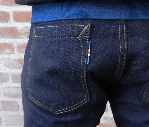
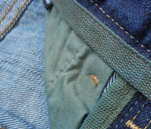
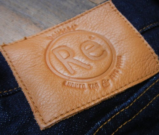
While we’re on the subject of denim, Ludwig finally made more denim jeans. I believe their last pair was released in 2009? Ironic considering the brand is always tinkering around with denim. Regardless its dope that they finally made some more. As to why these jeans are special, they’re a collab done with Rivi Goods, an artisan denim maker. They are constructed using 1980’s orangeline slevedge denim, think Levis, before production went overseas. If that wasn’t enough they are reinforced with og US military spec nylon webbing in certain areas. They also include a back label and calfskin patch. Americana at its finest.


Ludwig label.
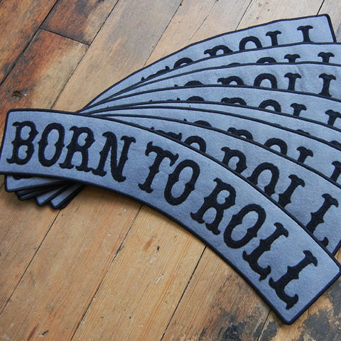
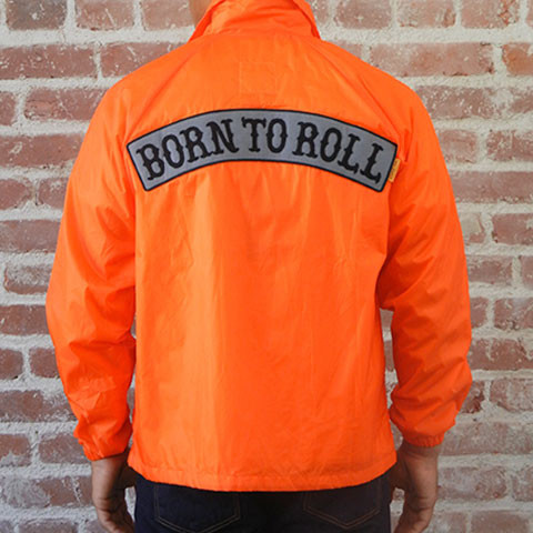
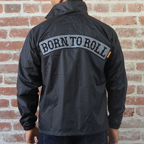
Arguably the instacop from this release were the crews, coach jackets and rocker patch. The Born to Roll patch is on both the crewnecks and coach jackets. They are very high quality and the look is very striking not to mention it gives off a strong feeling of 1950s America. One important thing to note about them is that they are made using chain stitching, meaning they were made by hand. Almost all modern embroidery is done by machines, so think about that. Born to Roll seems to be a call be back to the early bike clubs in America, however Ludwig encouraged fans to interpret the phrase anyway they see fit. The patch is fairly large and so it would look great on jackets and crewnecks. Born to Roll crew was given a heavy stone rinse to give each sweater a unique look. The patches on the crew come with a special label. Furthermore the crews have some subtle silkscreens, which are all indicative of Ludwig’s overall theme. The coaches are also pretty dope. They dropped in two c/ws and were constructed of nylon, with a mesh liner, plus Ludwig’s logo printed on the front. Overall the Born to Roll stuff seems to be heavily inspired by athleticism, probably because the owner practices MMA. There are also quite a few MMA fighters who rep the brand, so it may be a small shout out to them.


2016: Beethoven & Luxury
At the beginning of 2016 Ludwig released their Spring collection. This is different from the last release as Ludwig seemed to be going back to their roots. Now while the brand has done many projects that have dabbled in reappropriating vintage materials, for a time Ludwig Van was putting emphasis on their graphics. However they began to move away from being graphically driven, though the brand was still making graphic tees, cut n sew became more significant to the brand’s overall image. One of the main goals for this release was creating graphics which better reflect the brand’s overall concepts. Of course things probably won’t stay this way, which is why this release is particularly intriguing, as Ludwig Van tends to experiments and try new things with every release. The graphic aspect of Ludwig tends to reflect the current mentality of the man behind the brand or channel his artistic nature. Ludwig dropped their second collab with Rivi Goods which also took years to make, lastly the brand appropriated some well known Luxury logos to make something thats purely fun.
First off is the Regal. Now why I said this is interesting is because the Regal is the first true Ludwig graphic that has been released in a while. Thats not to say that the other tees aren’t indicative of Ludwig’s style. Its just that the regal isn’t a simple flip or takes cues from existing pieces of art. Instead It takes the core elements of the brand and juxtaposes everything together flawlessly to create something new. Such as Beethoven, Classical design, sleek motifs, a unique sense of symmetry, and a feeling of originality. This graphic represents everything that Ludwig Van is about, without being very predictable.


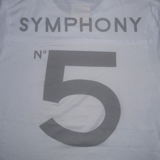
Symphony No. 5 has the simplest design of the three tees released. The print seems to be water based and feels very smooth. Its designed as a football jersey. The back graphic is big and definitely looks like it could be a jersey. The design is of course done as a Chanel flip, however it differs greatly in what others have done to the iconic No. 5 logo. Rather than mimicking the font Ludwig enlarged the 5 while keeping “No.” fairly small. The change is significant in that 5 becomes indicative of a sports jersey, however its a bit deeper than that. The whole idea of the sports jersey is that the wearer is loudly endorsing a player. However Symphony No. 5 is twofold in that a balance of Chanel and Beethoven are being channeled. Although right off the bat the musical reference is more apparent. Furthermore the tee feels a bit looser compared to the other tees, in order to better capture the sports look/feel. Regardless its a subtly complex tee that can be worn everyday.


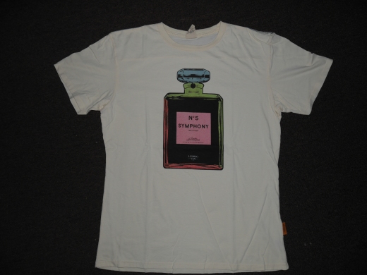
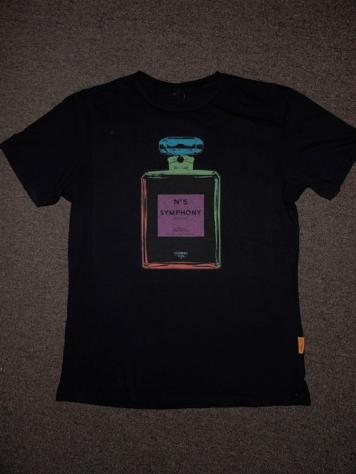
This last one in particular again shows off Ludwig’s graphic design prowess. No. 5 is another tee that taps into Chanel’s signature perfume, however its much different from Symphony No.5’s execution. Unlike Symphony No. 5, No.5 is much more colorful and plays extensively with text and is riddled with references. Aside from Chanel and Beethoven overall the print is an homage to Andy Warhol, who himself made prints based on No. 5 perfume for Chanel. Below the main text is “Deutsche Grammophon,” which is a nod to an iconic classical music label founded in 1898, the name itself translates to German Gramophone. Beyond the graphic visuals the text itself retains a lot of Chanel’s signature layout, but there are also Classical elements such as “Deutsche Grammophon” and “Ludwig Van.”

Every tee comes packed in its own reusable bag.


Signature Violet & Emerald stitching.

Ludwig Van label, front.


Ludwig Van Label, backside.

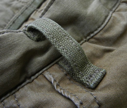
Finally, the most standout piece from Spring 16 has to be Ludwig’s second collab with Rivi Goods. Dubbed Case Shell Pants they are constructed of 1980s US Army case shells. So to clarify case shell are basically bags or boxes you store ammo inside, which may also function as a carrying case. Considering how much material was needed to make these pants, 100 were made, the case shells were likely used to carry around artillery or perhaps heavy caliber rifles. The 80s were the height of the Cold War, both America and the USSR were ready to go to war and possibly nuke everything into oblivion. The case shells were obviously used as some pants have prints or stitches on them, which has resulted in various shades of olive drab, so no two pairs are like. The primary material of the pants seems to be canvas, while also having nylon webbing as belt loops, as well as sporting nylon reinforcements in certain areas like the first Rivi Collab. The pants were given an enzyme wash in order to make the pants soft and comfortable. Rounding out the design there is a Rivi Goods tag, and another label from Ludwig Van. While this project seemingly took forever to be released, I think it was 4 years in the making, its definitely something that Ludwig wanted to make sure was executed properly. If you’re into vintage fabrics or Americana this is an instacop.


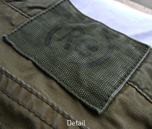
One last thing. Ludwig also dropped another patch. Called Libertas, its a fairly decent size, 5×5 inches. I believed they were used on some jackets a few years back. Like Born to Roll Libertas is made of a heavy wool with lots of hand stitching. The quality looks very on point, and it would probably look good as a should patch for your leather jacket…or denim jacket, or tee, etc. The price price practically makes the patch a steal.

Prints


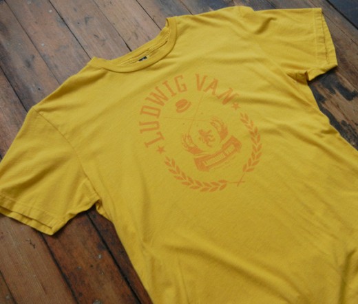
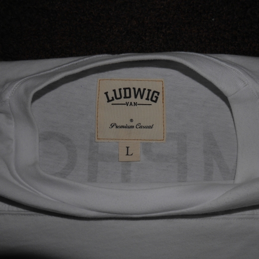
So overall both Releases were done very well. 2015 feels like its mostly about Americana. While 2016 digs heavily into Classical composer Beethoven while also paying tribute to Chanel. All the tees were made of fine Jersey, and washed in order to give them a softer feel and vintage look. Its important to understand that they are not made using regular blanks, instead they seem to have been custom made by Ludwig Van, this is obvious when you see the back of the tees. Furthermore I it seems that the tees were dyed after their graphics were printed on them. As you can see that the neck tags have an image of Alex de Large, which have been dyed on every tee to match their shirt’s corresponding color, save for the off white shirts. All items were made in Los Angeles. Theres something here for everybody who wants to stand out in Streetwear. Regardless Ludwig Van has delivered another great release, hopefully we’ll see more drops soon.
*Ludwig’s VAN Instagram.
*Ludwig’s website.
*Ludwig’s store.
*Ludwig’s Twitter.
*Ludwig’s Facebook.
